The Daily Dive #101 - SOPR And Illiquid Supply Analysis
Bull Market SOPR Analysis
A key indicator to track on-chain spending behavior and current market sentiment is the Spent Output Profit Ratio (SOPR). SOPR is calculated by dividing the realized value of a spent output (in USD) by the value at creation of the original. Simply put, it’s calculating the price sold over price paid for every UTXO that moves on-chain. The best place to read more on SOPR is here.
SOPR values greater than 1 indicate that on average, more profit is being realized while SOPR values less than 1 indicate that on average, more losses are being realized. At a value of 1, the market is net neutral. We can analyze SOPR behavior at a total market level and across long-term holders (LTHs) and short-term holders (STHs).
What to look for in the SOPR metric is the metric’s reaction around 1. During continued bull-cycle rallies, we consistently see more profit-taking behavior under 5% with these in-between periods when the market is neutral or break-even. You can see when SOPR bounces off of 1 and back to a state of profit taking during bull markets. When it falls below 1 and doesn’t reclaim that level, the market is signaling a bull market reversal forming as investors realize more losses, expecting price to go lower. Here, we use the Adjusted SOPR which ignores all outputs with a lifespan of less than one hour.
As we approach the tops of bull cycles, there are typically sustained, elevated levels of profit taking right before higher peaks. Eventually, the spent supply overwhelms new demand, and therefore a top forms. Currently, we’re seeing increased profit taking but not at the level of a cycle top or peak.
In previous cycles, there’s a rising trend of long-term holders realizing increased profits as price is bid up by new market entrants. Using a 30-day moving average to take a more macro view of the market, we look to have just started this increased trend of LTH profit taking. Profit taking is a healthy sign indicating the second stage of the bull market: distribution over accumulation, is beginning.
For short-term holders, there is a consistent trend of behavior during corrections in bull cycles. As price corrects, weaker hands capitulate and realize losses which puts more sell pressure on the market. We typically see the STH SOPR number reclaim a position back over 1 after this event, as new buyers are shaken out. Not reclaiming 1 would signal that the larger market of short-term holders are not willing to hold coins and rather want to sell them at a loss. For bull market cycles to continue, we’re looking to see the latest STH SOPR reclaim back over 1 when using the 24-hour MA chart. It’s already showing signs of doing so:
Illiquid Supply
For a detailed explanation of how bitcoin’s liquidity cohorts are quantified read this article.
Let’s revisit illiquid supply as a metric and decipher what signal it can provide as to the state of the bitcoin market.
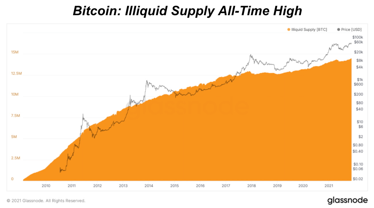
The illiquid bitcoin supply is currently at an all-time high of 14,540,738 BTC, and a look at the all-time history of the chart displays an extremely clear trend: up.
A closer look at the metric, starting at the beginning of 2020, shows the only time that illiquid supply meaningfully declined was in the middle of this year following the all-time high set in April.
Shown above is the history of bitcoin’s circulating supply grouped into various liquidity cohorts. A keen eye can spot that the combination of liquid and highly-liquid supply began to draw down meaningfully in March of 2020, and has continued the trend ever since (a brief deviation in May of this year aside). So what can this data tell us about the market?
A look at the ratio of total supply that is illiquid against liquid and highly-liquid supply provides fantastic insight, and we call the metric Illiquid Supply Shock, first coined by Will Clemente.
The Illiquid Supply Shock Ratio has broken its previous 2021 high, and if overlapped with the price of bitcoin since March of 2020, an extremely close correlation is found.
With Illiquid Supply Shock hitting new highs, we have yet another metric that points to bullish price appreciation over the short to medium term, while our long-term outlook on bitcoin and the Bitcoin network is always bullish.
While it is true that looking at the history of the metric, there looks to be zero relationship with price, there are three key distinctions that should be made:
The March 2020 macroeconomic shock changed the dynamics in the legacy financial system forever, and accelerated the pace of fiat monetary debasement on a global scale.
In the early days of bitcoin, even with a large amount of supply becoming illiquid, the rate of inflation was so high that the ratio was trending down (relative illiquidity of the bitcoin supply is decreasing) despite illiquid supply increasing.
The halving in May of 2020 further constrained the inflation rate, which simply exacerbated the accumulation trends that began to pick up following the March market crash.
With Illiquid Supply Shock hitting new highs daily, it is our view that price is soon to follow.
Stay bullish.


buy into weakness, sell into strength... it's just math. enjoy the ride!