

Bitcoin Technical & On-Chain Confluence
Beyond Price Action: How Realized Cap HODL Waves, Bitcoin Cycle Master, and Value Days Destroyed Reveal True Market Sentiment

Bitcoin price analysis benefits from combining technical indicators, multi-timeframe analysis, and advanced on-chain metrics to identify market cycles and support/resistance levels. By analyzing Bitcoin through multiple timeframes simultaneously, traders gain insights into the psychology of market participants operating across different analytical horizons.
The 350-Day Moving Average
Technical analysis is the evaluation of historical price and volume data to identify patterns and trends that can be used to attempt to predict future market behaviour. An example is the 350-Day Moving Average, which represents approximately one year of rolling Bitcoin price action. This metric has proven incredibly accurate at determining bull and bear market regimes. When price trades above this level, it typically sustains above it for extended periods. When price decisively crosses beneath it, extended downside typically follows.
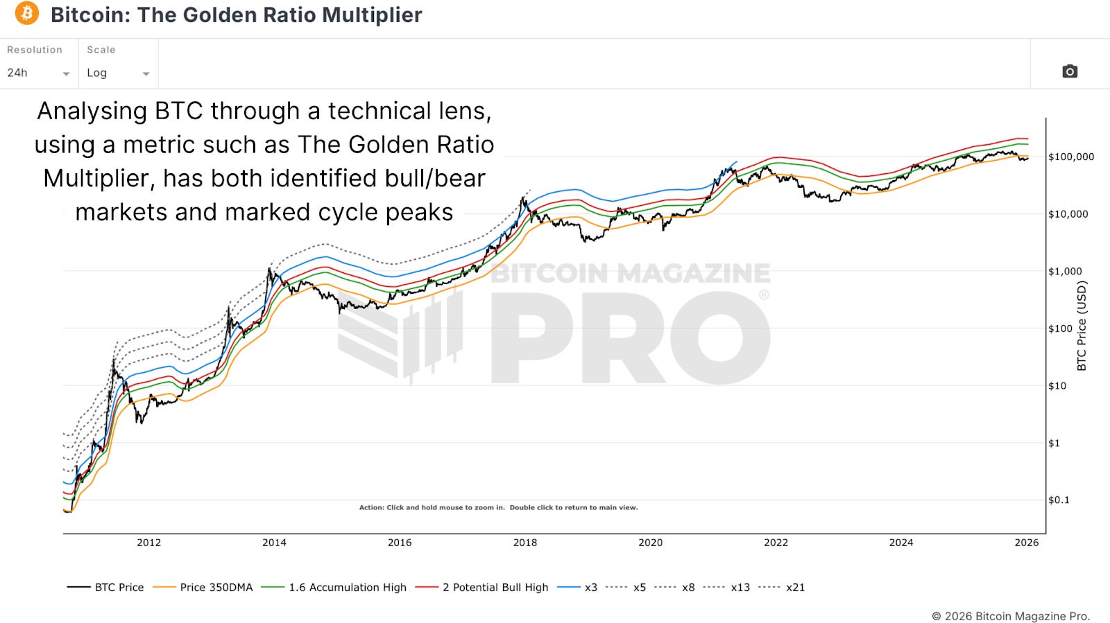
Figure 1: Illustrating Bitcoin’s price 350DMA with Golden Ratio and Fibonacci Sequence multiples.
When Bitcoin approaches this level from above during bear markets, it frequently acts as moving resistance. Traders aware that Bitcoin trades above this level expect bull markets and take profit opportunities that may have been missed at higher prices. Conversely, during bear markets, approaches to this level often trigger short-selling or further profit-taking.
The Fibonacci Sequence and Golden Ratio multiples can be applied to Bitcoin’s price cycles to identify historical topping points. By examining previous Bitcoin cycle peaks, a pattern emerges where each successive cycle peak reaches a lower Fibonacci multiplier. In the first cycle, Bitcoin reached a 21 multiplier level. In the next cycle, it reached the 13 multiplier. Then the 8 multiplier, and so forth, highlighting the compression of market volatility over time. This mathematical progression provides technical guidance on reasonable expectations for future cycle peaks without relying on static price targets.
Multi-Timeframe Analysis
Technical analysis benefits dramatically from examining Bitcoin across multiple timeframes simultaneously. While the 350-day moving average operates on daily charts, the 200-Week Moving Average (roughly four years of data) provides confluence on weekly timeframes. The 200-Week Moving Average has consistently marked bear market lows and accumulation zones throughout Bitcoin’s history.
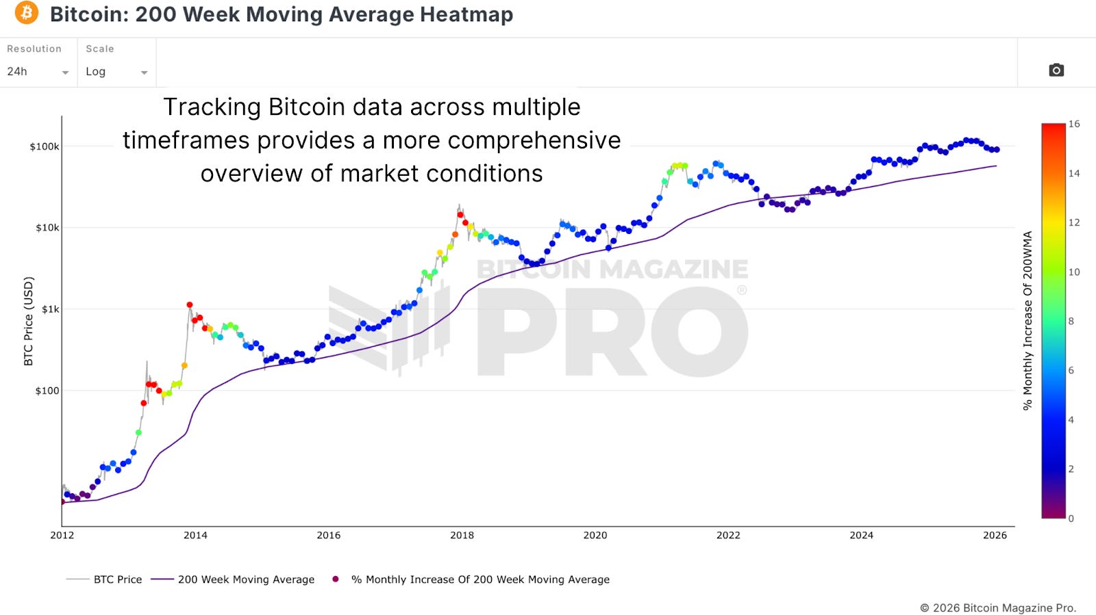
Figure 2: The close relationship between Bitcoin’s 200WMA and cyclical market bottoms.
When the same support or resistance level appears across multiple timeframes, the level gains strength and reliability. If traders analyzing daily charts see support at one level while those analyzing weekly charts see support at a similar price, enough participants are coordinating around that level to make it genuinely influential.

On-Chain Valuation Tools
Price forecast tools, such as the Bitcoin Cycle Master, aggregate multiple on-chain valuation methods to estimate Bitcoin’s “fair value” across different cycle phases. These methods include CVDD and Balanced Price calculations, which are complex but historically accurate at identifying cycle bottoms.
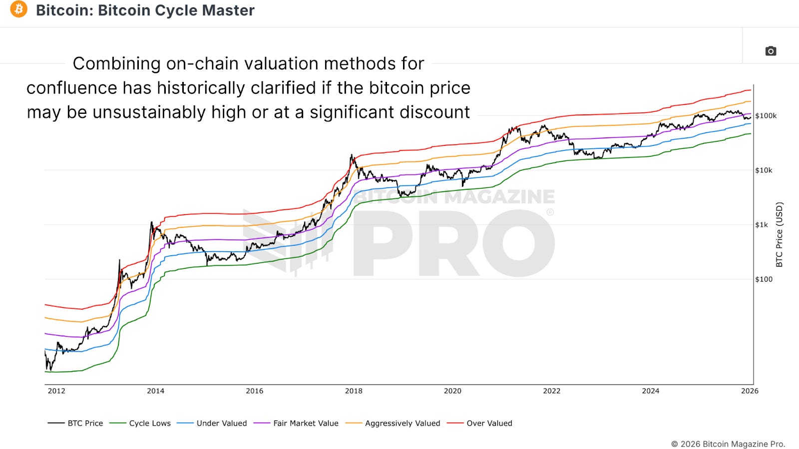
Figure 3: The Bitcoin Cycle Master chart combines multiple on-chain valuation metrics.
The Bitcoin Cycle Master aggregates all price forecast tools to categorize Bitcoin into zones, including fair market value (purple), overvalued (red), aggressively valued (orange), undervalued (blue), and cycle lows (green). Bitcoin respects these levels with remarkable accuracy. These zones provide support and resistance even more reliably than traditional technical analysis because they reflect on-chain supply-and-demand economics rather than pure price psychology.
Realized Cap & VDD
Realized Cap HODL Waves combine Realized Price (average cost basis) with HODL Waves (percentage held by different age bands) to show which cohorts of holders are influencing realized price movement. As Bitcoin accelerates to the upside, newer participants entering the market pay significantly more, causing the realized price to spike. This metric shows not just that new capital is entering but at what price, revealing whether the market is overheating.
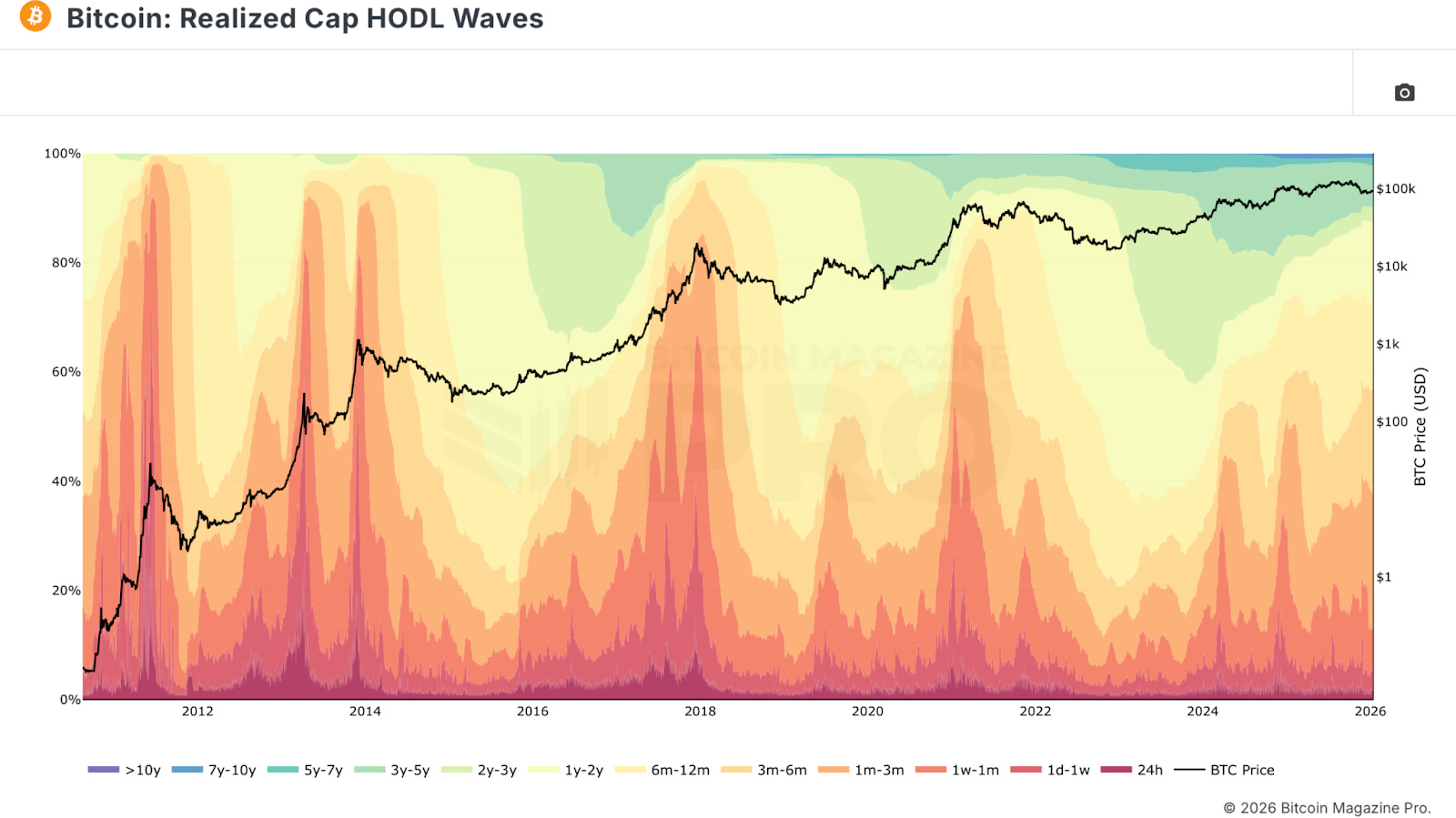
Figure 4: The Realized Cap HODL Wave chart combines holder data to gauge market conditions.
The Value Days Destroyed (VDD) Multiple measures USD-denominated profit-taking rather than just volume of coins moved. It calculates the 30-day average value days destroyed (number of coins moved multiplied by number of days since coins last moved multiplied by $BTC price) divided by the 365-day average. Spikes to red regions indicate market cycle peaks as distribution reaches historically elevated levels. This metric captures the severity of profit-taking in USD terms rather than pure Bitcoin volume.
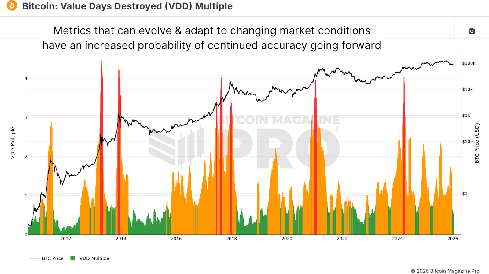
Figure 5: Historically, the Value Days Destroyed Multiple has indicated market peaks.
Conclusion
Analyzing Bitcoin requires reacting to data rather than predicting outcomes. Together, the metrics detailed in this article paint a comprehensive picture without over-reliance on any single indicator. On-chain metrics reflect actual holder behavior. Technical indicators reflect psychology. As Bitcoin enters increasingly complex cycles, understanding it from multiple simultaneous perspectives becomes essential.
For a more in-depth look into this topic, watch our most recent YouTube video here: Bitcoin Masterclass #4 | Market Cycles Made Easy
Matt Crosby
Director of Research & Analytics
Bitcoin Magazine Pro

For more detailed Bitcoin analysis and to access advanced features like live charts, personalized indicator alerts, and in-depth industry reports, check out Bitcoin Magazine Pro.
Make Smarter Decisions About Bitcoin. Join millions of investors who get clarity about Bitcoin using data analytics you can’t get anywhere else.
We don’t just provide data for data’s sake, we provide the metrics and tools that really matter. So you get to supercharge your insights, not your workload.
Take the next step in your Bitcoin investing journey:
Follow us on X for the latest chart updates and analysis.
Subscribe to our YouTube channel for regular video updates and expert insights.
Follow our LinkedIn page for comprehensive Bitcoin data, analysis, and insights.
Explore Bitcoin Magazine Pro to access powerful tools and analytics that can help you stay ahead of the curve.
Invest wisely, stay informed, and let data drive your decisions. Thank you for reading, and here’s to your future success in the Bitcoin market!
Disclaimer: This newsletter is for informational purposes only and should not be considered financial advice. Always do your own research before making any investment decisions.
Great breakdown. When technical structure aligns with on-chain strength, that’s usually where asymmetric opportunities form. If supply is tightening while price compresses, volatility expansion tends to follow. The real question isn’t if — it’s direction and timing.